
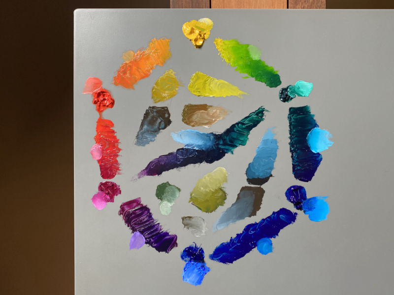
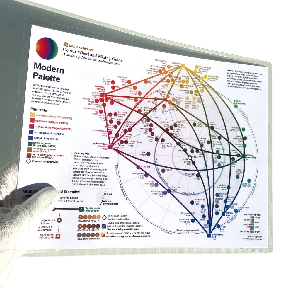
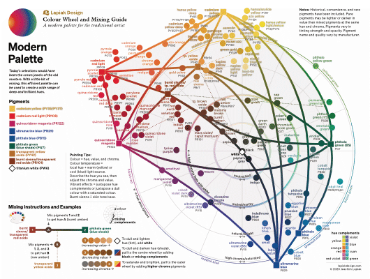
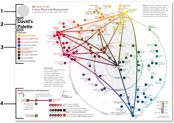
Modern Palette
My business is to paint what I see, not what I know is there.J.M.W. Turner
Free shipping
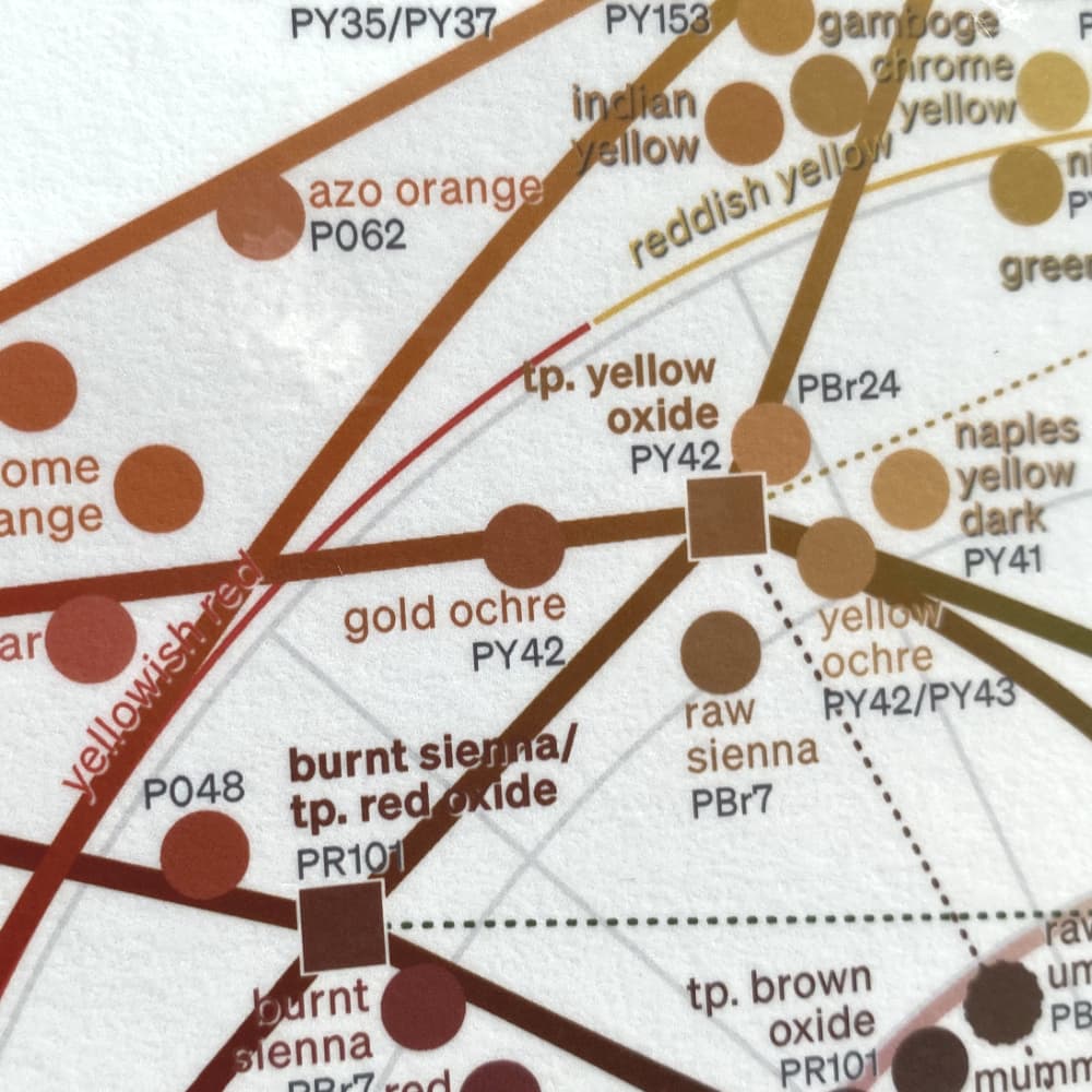
Today's selections would have been the crown jewels of the old masters. With a little bit of mixing, this efficient palette can be used to create a wide range of deep and brilliant hues.
Pigments (9): ◆ cadmium yellow (PY35) ◆ cadmium red light (PR108) ◆ quinacridone magenta (PR122) ◆ ultramarine blue (PB29) ◆ phthalo blue (PB15) ◆ phthalo green blue shade (PG7) ◆ transparent yellow oxide (PY42) ◆ burnt sienna/transparent red oxide (PR101) ◆ titanium white (PW6)
Tip: You don't have to use all of the pigments listed if you only plan on covering a specific gamut range. Mix burnt sienna/transparent oxide red with ultramarine blue to get a rich black.
Suitable for: Still life Landscape Portraiture Figure Alla prima
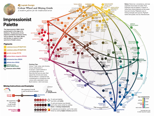
Impressionist Palette
The richness I achieve comes from Nature, the source of my inspiration.Claude Monet
Free shipping
The Impressionists (1860–1905) pushed paint to the edge of its brilliance. The discovery of new pigments enabled innovative artists, such as Monet, Van Gogh, Renoir, and Sorolla, to capture a wide spectrum of bright colours.
Pigments (8): ◆ cadmium lemon (PY35) ◆ cadmium yellow (PY35) ◆ pyrrole orange (PO73) ◆ quinacridone magenta (PR122) ◆ ultramarine blue (PB29) ◆ phthalo blue (PB15) ◆ phthalo green (blue shade) (PG7) ◆ titanium white (PW6)
Tip: There are a few ways of making a chromatic black. Mixing pyrrole orange with either ultramarine blue or a touch of phthalo green will create cool or warm neutrals. A deeper and cooler chromatic black can be made by mixing phthalo green with quinacridone magenta.
Suitable for: Still life Landscape Alla prima

Portrait of Dr. Gachet
Vincent van Gogh 1890
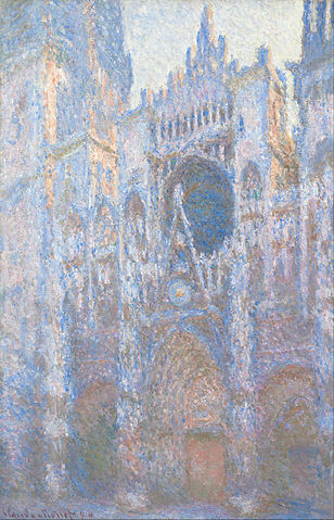
Rouen Cathedral, West Façade
Claude Monet 1894
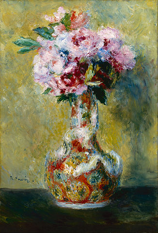
Bouquet in a Vase
Pierre-Auguste Renoir 1878
Related Movements: ◆ Post-Impressionism ◆ Expressionism ◆ Tonalism
Related Artists: ◆ Arkhipov ◆ Bashkirtseff ◆ Bazille ◆ Bonnard ◆ Boznańska ◆ Caillebotte ◆ Camarlench ◆ Cassatt ◆ Cézanne ◆ Chase ◆ Degas ◆ Fechin ◆ Gauguin ◆ John ◆ Klimt ◆ Korovin ◆ Krøyer ◆ Kupka ◆ Le Sidaner ◆ Levitan ◆ Hassam ◆ Inness ◆ Mancini ◆ Manet ◆ Monet ◆ Matisse ◆ Menzel ◆ Mogdigliani ◆ Morandi ◆ Morisot ◆ Munch ◆ Picasso ◆ Pissarro ◆ Renoir ◆ Rozentāls ◆ Sargent ◆ Schiele ◆ Serov ◆ Seurat ◆ Signac ◆ Sisley ◆ Sorolla ◆ Sparhawk-Jones ◆ Thomson ◆ Toulouse-Lautrec ◆ Vaes ◆ Van Gogh ◆ Walter-Kurau ◆ Whistler
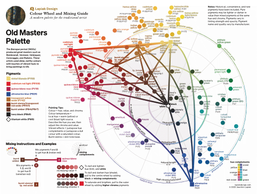
Old Masters Palette
Practise what you know, and it will help to make clear what now you do not know.Rembrandt van Rijn
Free shipping
The Baroque period (1600s) produced great masters such as Rembrandt, Vermeer, Velázquez, Caravaggio, and Rubens. These artists used deep, earthy colours with touches of vibrant hues to bring paintings to life.
Pigments (9): ◆ nickel titanate (PY53) ◆ cadmium red light (PR108) ◆ quinacridone rose (PV19) ◆ ultramarine blue (PB29) ◆ transparent yellow oxide (PY42) ◆ burnt sienna/transparent red oxide (PR101) ◆ burnt umber (PBr7) ◆ ivory black (PBk9) ◆ titanium white (PW6)
Tip: It's recommended to use burnt umber only in the underlayers. Switch to black with transparent red and yellow oxides for the following layers.
Suitable for: Still life Portraiture Figure
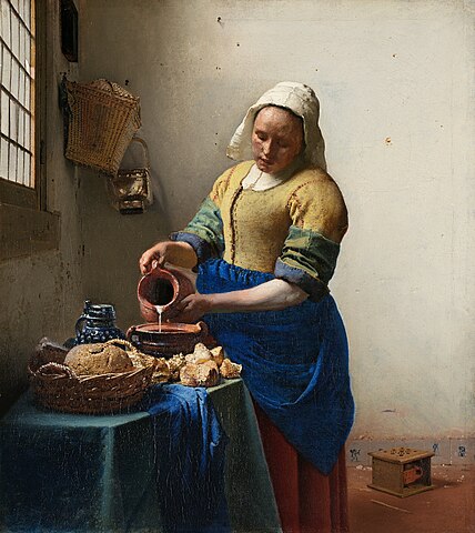
The Milkmaid
Johannes Vermeer c.1660

A Basket of Flowers
Jan Brueghel the Younger c.1620

Heroine from the Old Testament
Rembrandt van Rijn 1633
Related Movements: ◆ Neoclassicism ◆ Pre-Raphaelites ◆ Romanticism ◆ Rococco ◆ Realism ◆ Utrecht Caravaggism
Related Artists: ◆ Alma-Tadema ◆ Bastien-LePage ◆ Beale ◆ Bellotto ◆ Bernini ◆ Bonnat ◆ Boucher ◆ Bouguereau ◆ Brueghel ◆ Carracci ◆ Canaletto ◆ Caravaggio ◆ Caspar Friedrich ◆ Chardin ◆ Constable ◆ Copley ◆ Corot ◆ Courbet ◆ Cuyp ◆ Dagnan-Bouveret ◆ David ◆ De Haes ◆ De Heem ◆ De Hooch ◆ Delacroix ◆ Delaroche ◆ Denner ◆ Dobson ◆ Domenichino ◆ Dou ◆ Drouais ◆ Gainsborough ◆ Gentileschi ◆ Géricault ◆ Goya ◆ Grimshaw ◆ Guercino ◆ Hals ◆ Hammershøi ◆ Hertervig ◆ Hobbema ◆ Hogarth ◆ Holl ◆ Honthorst ◆ Ingres ◆ Jordaens ◆ Kauffmann ◆ Kuntz ◆ Poussin ◆ Lanfranco ◆ Le Brun ◆ Lievens ◆ Lorrain ◆ Matejko ◆ Mengs ◆ Metsu ◆ Millet ◆ Murillo ◆ Ortiz ◆ Portaña ◆ Rembrandt ◆ Reni ◆ Repin ◆ Reynolds ◆ Ribera ◆ Rubens ◆ Ruysch ◆ Sassoferrato ◆ Seybold ◆ Teniers ◆ Ter Borch ◆ Ter Brugghen ◆ Tiepolo ◆ Turner ◆ Van Aelst ◆ Van Baburen ◆ Van Dyck ◆ Van Huysum ◆ Van Mierevelt ◆ Van Ruisdael ◆ Velázquez ◆ Vermeer ◆ Vouet ◆ Zurbarán
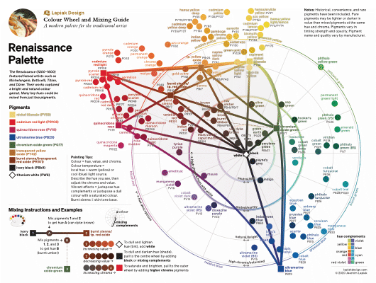
Renaissance Palette
It was much better to insist on the genuine forms of nature, for simplicity is the greatest adornment of art.Albrecht Dürer
Free shipping
The Renaissance (1300–1600) featured famed artists such as Michelangelo, Botticelli, Titian, and Dürer. Their works captured a bright and natural colour gamut. Many key hues could be mixed from just two pigments.
Pigments (9): ◆ nickel titanate (PY53) ◆ cadmium red light (PR108) ◆ quinacridone rose (PV19) ◆ ultramarine blue (PB29) ◆ chromium oxide green (PG17) ◆ transparent yellow oxide (PY42) ◆ burnt sienna/transparent red oxide (PR101) ◆ ivory black (PBk9) ◆ titanium white (PW6)
Tip: To get an opaque yellow or orange, mix some nickel titanate with a small amount of cadmium red light.
Suitable for: Still life Landscape Portraiture Figure
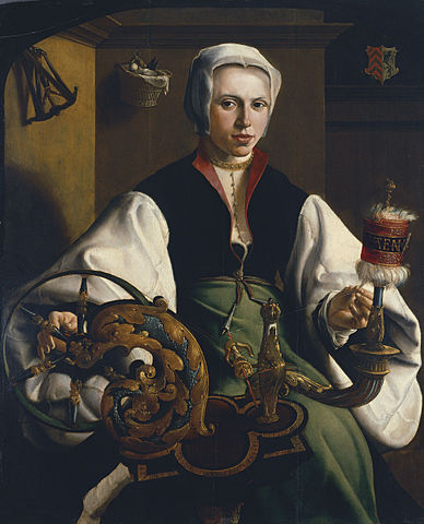
Portrait of a Lady Spinning
Maerten van Heemskerck c.1531

The Sistine Madonna
Raphael 1512–1513

Bacchus and Ariadne
Titian 1520
Related Movement: ◆ Quattrocento ◆ Mannerism
Related Artists: ◆ Altdorfer ◆ Anguissola ◆ Arcimboldo ◆ Barocci ◆ Bassano ◆ Bosch ◆ Bellini ◆ Bronzino ◆ Bruegel ◆ Berruguete ◆ Botticelli ◆ Correggio ◆ Cranach ◆ Da Vinci ◆ Del Piombo ◆ Del Sarto ◆ Del Vaga ◆ Dürer ◆ El Greco ◆ Fontana ◆ Giorgione ◆ Giovane ◆ Grünewald ◆ Holbein ◆ Lippi ◆ Lochner ◆ Lotto ◆ Pantoja de la Cruz ◆ Parmigianino ◆ Pontormo ◆ Primaticcio ◆ Memling ◆ Michelangelo ◆ Morales ◆ Moroni ◆ Romano ◆ Sánchez Coello ◆ Tintoretto ◆ Titian ◆ Van Eyck ◆ Van der Goes ◆ Van Leyden ◆ Van Heemskerck ◆ Veronese ◆ Weyden ◆ Yáñez de la Almedina ◆ Zuccari
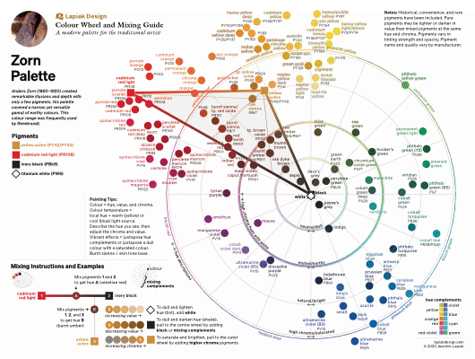
Zorn Palette
Simplicity is the ultimate sophistication.Leonardo da Vinci
Free shipping
Anders Zorn (1860–1920) created remarkable illusions and depth with only a few pigments. His palette covered a narrow yet versatile gamut of earthy colours. This colour range has been used since Apelles and extensively by numerous artists, especially Hals, Ribera, and Rembrandt.
Pigments (4): ◆ yellow ochre (PY42/PY43) ◆ cadmium red light (PR108) ◆ ivory black (PBk9) ◆ titanium white (PW6)
Tip: To capture the full hue range of this palette: Mix yellow ochre and black to get shades of green. Black and white make perceptible tints of steel blue.
Suitable for: Portraiture Figure

Self Portrait with Model
Anders Zorn 1896
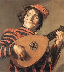
Buffoon with a Lute
Frans Hals c.1623
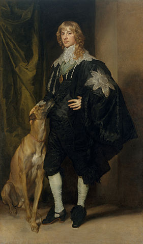
James Stuart, Duke of Richmond and Lennox
Anthony van Dyck 1634–35
Custom Palette
Personalize your palette for $74.99 Free shipping
Customize your palette by choosing 3–10 pigments + white.
- Your custom photo cropped in.
- The first name of whom the palette belongs to.
- Your chosen list of pigments will correspond to the colour gamut within an optimal mixing arrangement.
- Instructions for mixing will be relevant to your pigment colour gamut.